Book Cover
The prompt
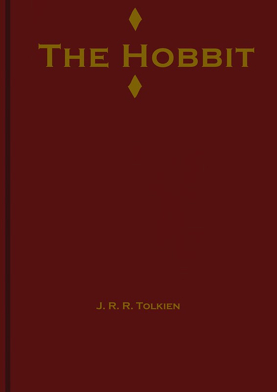
Is this the most original or involved project I’ve ever done? No, no it’s not. But there’s beauty in simplicity. The Hobbit is one of my favorite books of all time. Since it’s such a classic story that doesn’t need to sell itself (if you weren’t going to buy a copy, a flashy cover isn’t going to sell you), I went with a fairly simple design. If you know Tolkien’s lore, you’ll know that the reason he gives for all his characters speaking English is that he found the stories in an old tome called “the red book” and translated them for a modern audience, so I went with a red cover and gold lettering.
I designed this on Krita, which is a free, open-source art program that I have next to no experience with. If I was more experienced in there, I might have been able to make it look better, since as it stands it’s pretty bad. But I did my best, and Bob would say that’s what counts, right?
7 Comments
Pingback:
Zoe
I did an assignment similar to this. Except, instead of simply designing a new cover for a book I had to create a new cover that would make it seem like the book was about something different.
Pingback:
Bird Hanning
I like the simplicity, the mystery of it pulls me in. Besides, I really like the way that you explain how red has meaning. It’s an interesting story that Tolkein told to explain his big one. I work in a library and I can definitely say that this design is something I wouldn’t be surprised to find in the stacks.
Pingback:
Pingback:
Pingback: